Liah Carpenter's Masterpieces
  • Art III
  • Art II
  • About
  • Contact

Intelligence without ambition is like a bird without wings.

Per aspera ad astra

my pinterest

Final Blog Post

1/7/2016

0 Comments


One contemporary artist that influenced me...
Picture
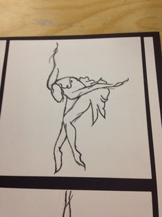
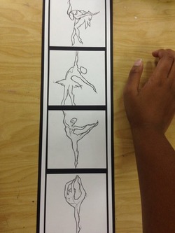
​One contemporary artist that influenced me was the animation artist Glen Keane. The creator of the short animations "Duet" and "Nephtali" especially are two pieces of his that inspired me the most. I was most inspired because of the ballet-centric subject matter that I feel was portrayed beautifully in "Nephtali". Artists like him remind me of why I enjoy learning which lines, shapes and curves help to imitate the human physique. The abstract and subtle "unfinished"-ness of his sketches inspired me to make this.
Picture
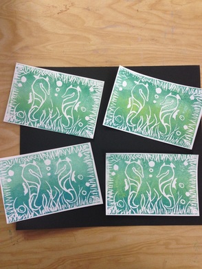
Another project that was inspired by Keane was this one, made for the "one thing you never got to say" assignment. Though it doesn't resemble the art style of Keane that much, it does have a very aquatic theme to it, and because Glen Keane was one of many animators that helped to create the 1989 Walt Disney film, The Little Mermaid, they are connected in a certain way. Glen Keane helped me grow as an artist by inspiring me to broaden my horizons as well as gain more confidence in drawing human-like figures.
0 Comments

Print Making- Words Never Said

12/11/2015

0 Comments

 
Picture
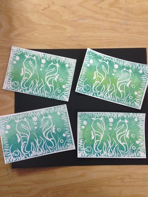
For this project, we were supposed to convey something that we "wanted to say but never did" in an art piece. Something that I sometimes wish I would say more often is, "Hello," because greeting someone is always the first step in forming relationships that can potentially build into friendships. I expressed this in a linoleum cut, which depicts two seahorses coming face-to-face in a sort of "initial interaction" scene taking place deep in the ocean. In all four of them, I tried to have the intensity of each color that I used vary. For example, the top right has more visible yellow than blue, and the bottom left has more visible blue than yellow, etc. And then I kind of just threw them on a black sheet of paper so that it would have a natural/organic looking layout. 

0 Comments

NCMA

12/4/2015

0 Comments


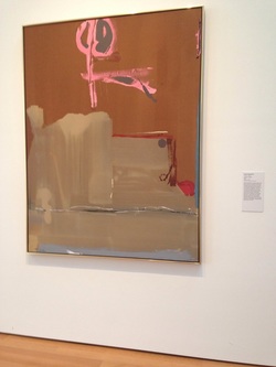
Last week, our art class took a field trip to the North Carolina Museum of Art. Here's a brief snippet of what we saw. Starting from least understandable to most brilliant (in my individual opinion, of course).

Picture
This. When I first saw this, I really didn't get it. It almost looks like something that could be found pinned up somewhere in an elementary school hallway. But to each his own...

Picture
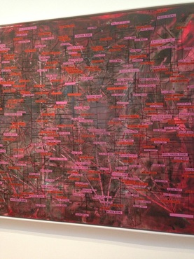
This piece I feel was a lot more involved. In a sense, it is a visual map of people gone missing during a specific time period in history (I can't remember the details). Each red or pink rectangle (pink for females, red for males) has written on it a name, and that name is placed on a geographical map of where the person was from. At first all the bells and whistles made it a tad confusing, but after reading the information plaque to it's right, the subject matter and presentation of real life events seemed outstanding.

Picture
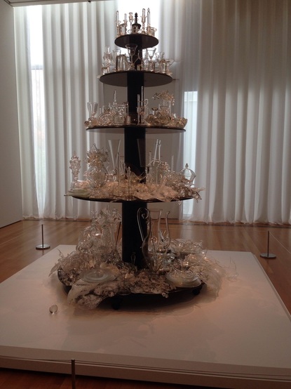
Finally, there is The Bride. Ever since Mrs. Purtee showed it to us in Art II, I always liked this sculpture. And seeing it in real life did not disappoint. I have always felt that the state of glass tells a story as the the tiers descend, and at the bottom everything is shattered and broken- a stark contrast to the top. I feel like this piece is filled with many beautiful metaphors, obvious or not, that might not be so apparent at first glance.
0 Comments

Non-Conventional Materials Project

11/22/2015

0 Comments


Take something atypical and turn it into art.

Picture
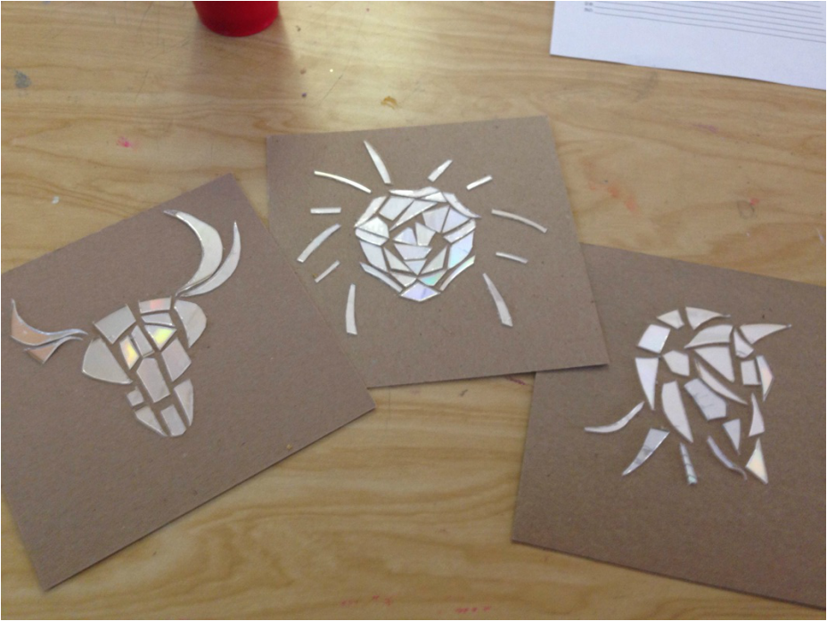
 In order to assemble my final creation (image above), I had to determine a material to use- the material, however, could not be a traditional art tool. So eventually I found myself tinkering with a few spare CD's, cutting them up into irregular shapes and placing them accordingly to take a form. Those forms turned out to be animals. I chose this medium because I was interested in creating shapes with smaller, more intricate shapes. My purpose was not for each animal to be made perfectly symmetrical, or anything of the like, but rather I chose to embrace the subtle lopsidedness/abstract flare that each smaller shape brought to the big picture.  (Left: Bull-thing, Middle: Lion, Right: Bird)
0 Comments

Post Modern Principles

11/1/2015

9 Comments

 
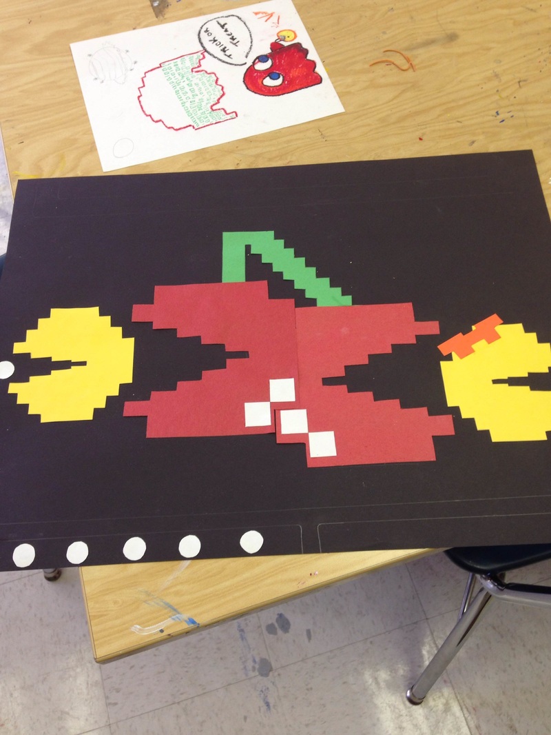
For this project I chose appropriation for my post-modern principle. It is represented in this artwork because I stole the idea of the pixelated Pac-Man characters, and then appropriated it so that the cherries were eating Ms. and Mr. Pac-Man, which introduced a component of irony. I created this because I like video games and wanted to make something that was kind of retro looking (hence the mimicking of pixels). 
Picture
9 Comments

Unconventional Materials

10/20/2015

0 Comments


I think that it's interesting how we can use unconventional art materials/processes to accomplish artworks equivalent to, if not exceeding, art pieces created using traditional supplies. This challenges students to create things that are not expected and more "out of the box".

As seen in the pictures of above, it is very possible to create a work of art even more breath taking than one that uses common materials, such as paint. In some cases, such as the bust made of books in picture 1, unconventional properties adds an eye catching/unexpected element of texture and color. 
0 Comments

The Post-Modern Principles 

10/9/2015

0 Comments

 
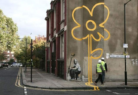
I think that the principles and elements of art are good guidelines that should definitely be taken into account during the planning/brainstorming process, as they are vital and fundamental components of art. However, some have deemed these same elements and principles of art as outdated, even obsolete. So instead of making these post-modern principles the "art education gospel," as the article refers to them as, components such as texture and form should rather be used as devices to enhance the meaning of the art, rather than being the topic of discussion.  
Picture
Banksy street art.
0 Comments

Inspired by a Question

10/4/2015

0 Comments


What might infinity feel like? What does it look like? How can we cope with the thought of infinity and endless time?

Picture
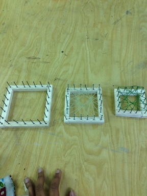
For this project, we were asked to come up with a series of questions. To take it a step further, we then created a project inspired by the topic and questions that we brainstormed. So for mine, I thought of infinity. Infinity for me has always been a hard idea to mentally grasp- not specifically infinity, but endlessness. Death, time, and space itself all come to mind when thinking of endlessness; all of which seem to transcend the understanding of human knowledge even to this day.

So in light of that, what I created was my representation of "endlessness," made of string, nails, and soft wood. I formed three squares out of the wood, all varying in size, and stuck the nails in them, like a border. Then, by weaving the string around the nails in numerous different ways, I was able to create a pattern within each of the squares. The final step to the process will be to layer them behind one another, from largest to smallest, mimicking the form of a never-ending tunnel.

0 Comments

Art, or Decoration?

9/16/2015

0 Comments

 
Picture
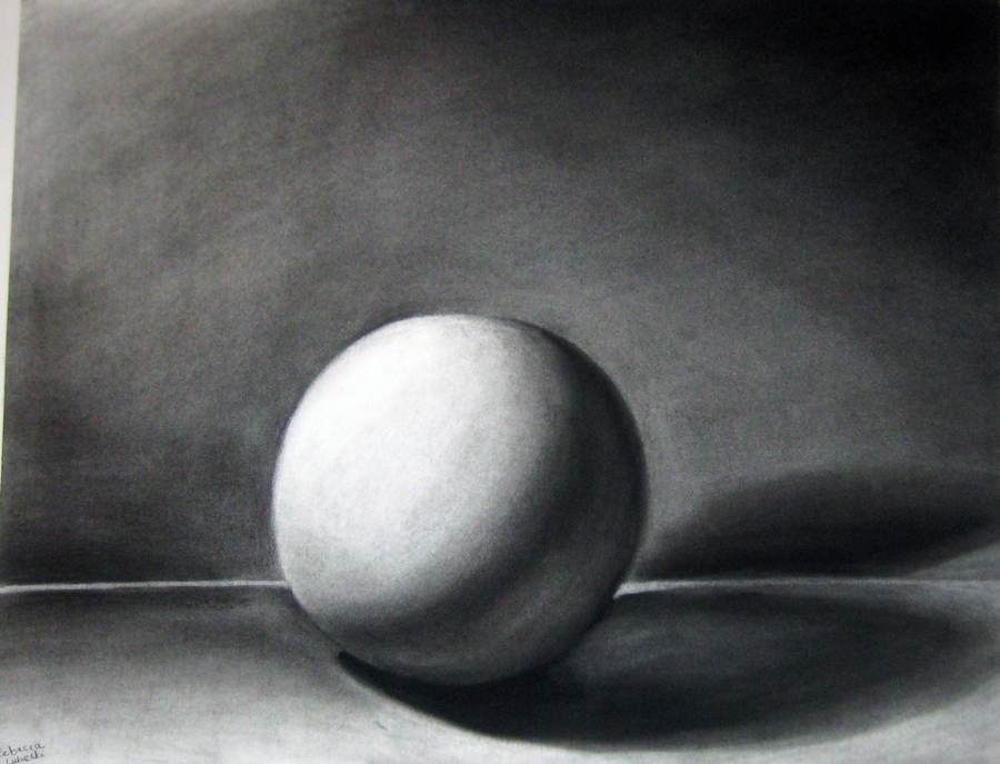
Much like art itself, the answer to the question, "Is art without meaning decoration?" is very much subjective. Vocabulary.com defines art as "the expression of ideas and emotions through a physical medium." That being said, I believe that any object or subject matter portrayed in a piece of artwork is the idea itself. So, when students demonstrate value by shading a seemingly meaningless sphere, that sphere becomes the idea. And where there is an idea, there is art. 
0 Comments

Element of Art: Line

9/10/2015

0 Comments

 
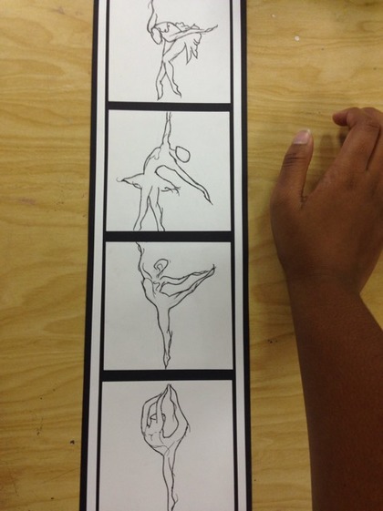
PictureFinal product.
The element that I chose for our first project was line, which I incorporated in the form of gesture drawings. I also used line by drawing additional gesture lines inside the outlines of the ballerinas to further incorporate graceful motion and fluidity of body movement. 


My chosen media was black and white construction paper, as well as black sharpie pen. The black paper is used as the background. I fashioned the white paper into four 4x4 squares, which I then arranged vertically and bordered with two long, narrow strips.The purpose behind this choice of material was to create a greater contrast, as well as fine, delicate pen strokes. 


This subject intrigued me because I have an interest in the form and shape of the human body. I also enjoy watching people dance, such as the ballet or ice skating, because I personally find it breathtakingly beautiful.

Picture
A close-up of the top picture.
0 Comments

    Author

    Liah Carpenter is a junior in high school, with a passion for all things liberating.

    Archives

    January 2016
    December 2015
    November 2015
    October 2015
    September 2015

    Categories

    All

    RSS Feed

Powered by Create your own unique website with customizable templates.
  • Art III
  • Art II
  • About
  • Contact